Understanding the Principles of Grid Design
From the early days of typography and print to the dynamic digital landscape of today, grid design has been instrumental in shaping how information is presented and consumed. Its evolution mirrors the advancements in design technology and the changing needs of communication mediums. Whether you’re a seasoned designer looking to refine your skills or a newcomer eager to grasp the fundamentals, this article aims to equip you with the knowledge and insights needed to harness the full potential of grid design in your creative endeavors.
Principles of Grid Design
Alignment and consistency lie at the core of effective grid design, ensuring that elements within a layout maintain a sense of order and cohesion. By aligning elements to the grid, designers establish a visual connection between different parts of a design, improving readability and guiding the viewer’s eye. Consistent spacing and alignment further reinforce this coherence, creating a harmonious balance between elements and enhancing the overall visual appeal.
Hierarchy and proportion play crucial roles in guiding the viewer’s attention and conveying the relative importance of different elements within a design. Through the strategic use of grid structure, designers can establish clear visual hierarchy, directing the viewer’s focus towards key content while maintaining balance and order. Proportional relationships between elements ensure that each component of the design contributes to a cohesive and visually pleasing composition.
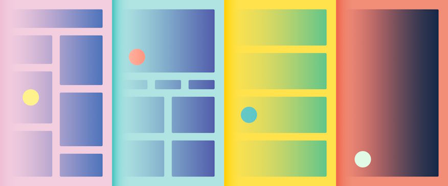
Flexibility and adaptability are essential principles in modern grid design, given the diverse range of content types and devices used for consumption. Designing grids with flexibility allows for seamless integration of different content formats, accommodating varying content lengths and types. Additionally, adapting grids to various media and screen sizes ensures optimal display across different devices, maintaining the integrity of the design regardless of the viewing context.
Visual harmony and white space are fundamental aspects of grid design that contribute to the overall aesthetic appeal and readability of a layout. Creating visual harmony through balanced white space helps maintain a sense of equilibrium and allows content to breathe, enhancing clarity and comprehension. By utilizing white space effectively, designers can create designs that are not only visually appealing but also easy to navigate and understand.
Practical Applications of Grid Design
In the realm of editorial layouts, grid design serves as the backbone of magazine and newspaper design, facilitating the organization and presentation of content in a visually appealing manner. From the iconic grid structures of publications like Vogue to the modular layouts of newspapers such as The New York Times, grid systems form the basis of editorial design, ensuring consistency and coherence across pages while allowing for flexibility in content placement.
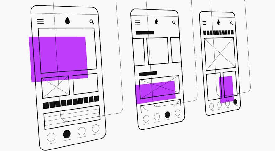
Web design also heavily relies on grid-based layouts to create visually engaging and user-friendly interfaces. Grid systems provide structure and organization to web pages, guiding the placement of elements and enhancing the overall user experience. Additionally, responsive design principles are seamlessly integrated with grids, ensuring that layouts adapt fluidly to various screen sizes and devices, maintaining consistency and usability across platforms.
In branding and identity design, grids play a crucial role in establishing visual consistency and cohesion across different brand materials. Grids are often used in logo design and brand identity systems to maintain alignment and proportions, ensuring that the brand’s visual identity remains cohesive and recognizable across various applications. By adhering to grid-based guidelines, designers can create brand materials that exude professionalism and coherence, reinforcing the brand’s identity and values.